File talk:World population density map.PNG
Australia incorrect[edit]
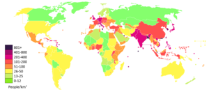
Australia is shaded incorrectly. Its population density is approximately 3 per square kilometre but is shaded as 26-50. Image requires correction and update. Simonmetcalf (talk) 05:09, 5 September 2015 (UTC)
Why is India shown in the > 1000 colour although it has only 328 inh./km² (also in the March 2006 version)? -- 80.133.134.121 21:29, 7 February 2007 (UTC)
- No it isn't. Look at Bangladesh, which is darker. --BDijkstra (talk) 20:18, 17 March 2011 (UTC)
Re drawing the map[edit]
@Leftcry, Kohelet, Yair rand, Cflytle, and Aivazovsky~commonswiki:


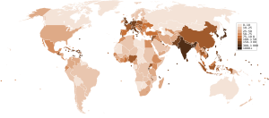
I would like to redraw/redevelop the map as I think that the non linear colour scheme is confusing. It does not use either a straight tonal scheme as used in the brown toned previously used map or a green to red spectrum based scheme as used in presenting birthrate and other comparative information. There is also a technical problem at present in that the map's borders do not seem well defined (they gradually fade into white) and this will make future editing difficult as the typical paint bucket function of standard paint programmes will not very readily work. I was wondering about the best base map to use and was looking at using the brown base map which I think is comparatively clearly defined but also looked at: File:All colonies blank map.png. Is there anything else, perhaps in Category:Blank maps of the world without Antarctica that would be better suited?
GregKaye (talk) 08:09, 20 May 2015 (UTC)
- I will work on a spectrum colours based map, GregKaye (talk) 11:08, 20 June 2015 (UTC)